Great user interfaces are invisible. When everything works intuitively, users don't think about the design. They simply accomplish their goals without friction. That's the philosophy behind modern UI design, and it guides every decision a designer makes.
Principles of Minimal Design
Minimalism is not about removing elements until nothing is left. It is about ensuring every element serves a clear purpose. Start with the content and let the design wrap around it naturally. White space is your most powerful tool for creating visual hierarchy.
Apple has mastered this approach across their product line. Their interfaces use generous spacing, consistent typography, and subtle color palettes. The result feels clean, professional, and focused on what matters most to the user.
Every pixel should earn its place on the screen. If an element does not contribute to the user's task, remove it. This ruthless editing process produces interfaces that feel effortless to navigate.
Typography Matters
Choose fonts that reflect your brand personality. System fonts like SF Pro offer excellent readability and feel native on every platform. Pair a strong heading font with a clean body font for visual contrast and hierarchy.
Font size hierarchy guides the reader's eye through the content. Use large, bold headings for section titles, medium weights for subheadings, and comfortable body text sizes for paragraphs. Consistent spacing between these elements creates a visual rhythm that feels natural.
Line height and letter spacing are often overlooked but crucial. Body text typically reads best at 1.5 to 1.8 line height. Headings can be tighter at 1.1 to 1.3. These small details compound into a significantly better reading experience.
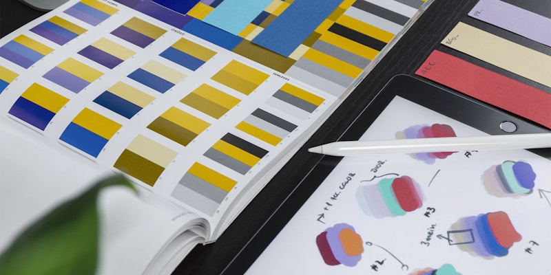
Color and Contrast
Modern interfaces often use restrained color palettes. A neutral background with one or two accent colors is usually sufficient for most applications. Reserve bold colors for interactive elements like buttons and links where you need to draw attention.
Dark mode has become a standard expectation across platforms. Design with both light and dark themes in mind from the beginning rather than treating dark mode as an afterthought. Test your color choices against accessibility contrast ratios to ensure readability for everyone.
Responsive by Default
Mobile-first design means starting with the smallest screen and progressively enhancing for larger displays. This approach naturally produces cleaner, more focused interfaces because you are forced to prioritize content.
Touch targets should be at least 44 pixels on mobile devices. Navigation patterns should adapt to the platform. Use bottom tab bars for mobile apps, horizontal navigation for desktop websites, and consider how thumb reach affects mobile usability across different device sizes.
Conclusion
Beautiful interfaces emerge from thoughtful decisions about spacing, typography, color, and interaction. Focus on clarity and simplicity in every element. Your users will notice the difference, even if they cannot articulate why the experience feels so smooth and enjoyable.